(Pronounced Ooun-naaw-thi)
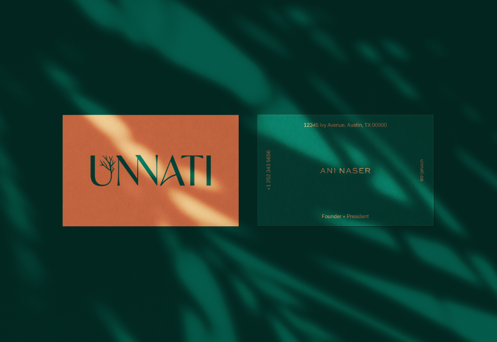
Unnati is a grassroots non-profit organization founded in Austin, dedicated to fostering sustainable and equitable community development. I was asked to create a brand identity that emphasized their forward thinking strategies and desire to uplift local minority-owned businesses.

1) The tree in the U symbolizes the growth and improvement Unnati strives to bring to local businesses and entrepreneurs.
2) The connected Ns visual communicates their mission to build bridges between diverse, underserved communities.
3) The rising ligature in the A conveys the forward-thinking approach of Unnati to uplift marginalized communities through opportunity